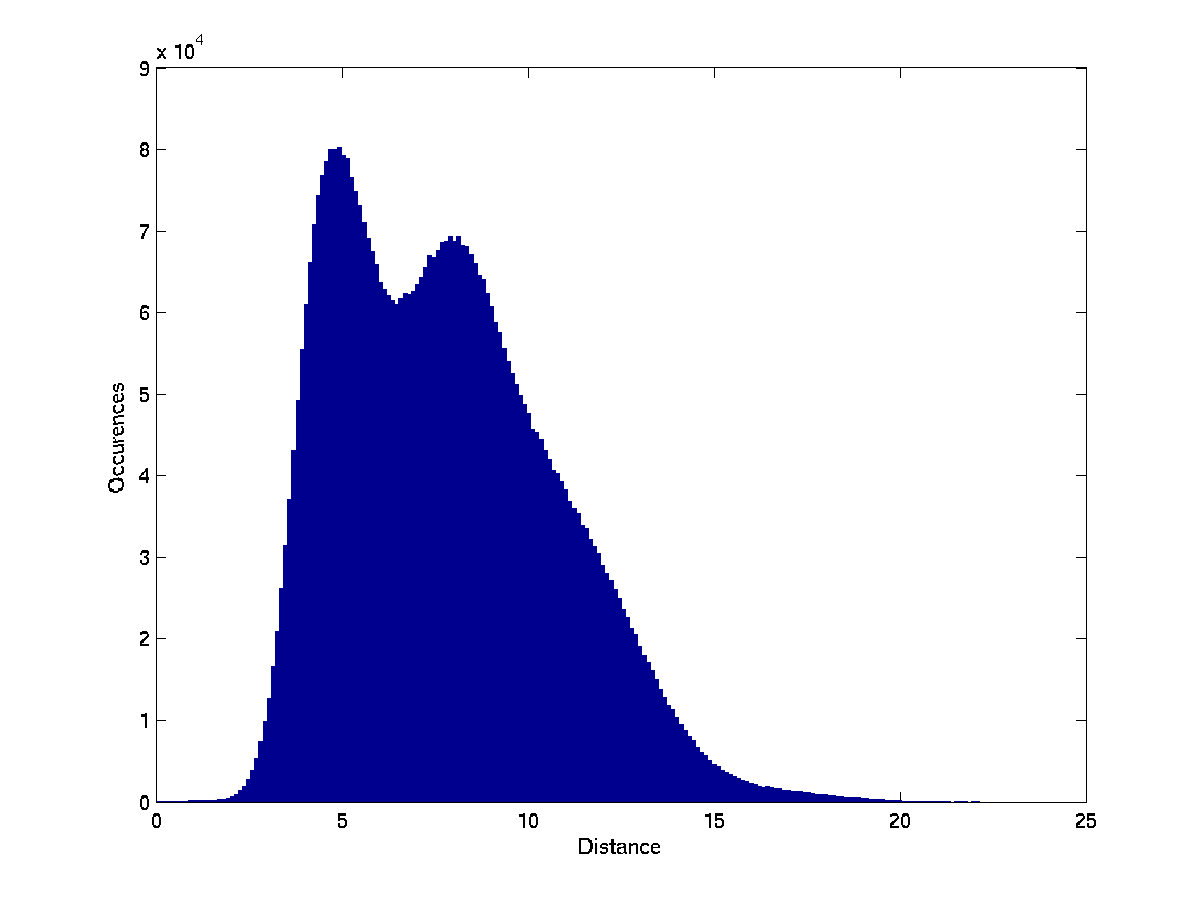
To investigate how well the clusters found for each test represent real use-model properties of the computer systems in the sample, we used external information on each computer system in our sample, that included specifications of installed hardware and software components and their configuration parameters. The information was represented as binary features of the computer systems. For each cluster in each test, we searched for the binary feature that had the highest mutual information with the property of belonging to the cluster. In Figure
![[*]](crossref.png)
we list the highest mutual information found in each test. The clusters in the Spearman feature-set are consistently more correlated with actual properties of the computer systems. Since there are usually several such features and their interpretation is highly technical, we do not list here the actual features for each cluster.
The cluster with the highest mutual information coefficient in all our
tests is one found in the Spearman test conducted with three
clusters. It has mutual information of 0.9 with the best-correlated
features of the systems; it was therefore easiest to find its
`meaning'. The features that were
most highly correlated with this cluster indicated that several
services related to IBM Director are installed on the computer systems in this cluster,
but not on computer systems that are not in this cluster.
IBM Director is a suite of tools
for managing computer systems that affects the behavior of many
components in the system. It is therefore reasonable that it would
significantly affect the log behavior of systems.
An interesting
addition to our log ranking tool would be the ability to automatically
generate and display a meaningful description of the cluster to which the inspected system belongs.
Figure:
The maximal mutual information between a cluster and a binary feature found in each of the clustering tests.
|
|
If the clusters truly represent sets of systems that are more
homogeneous in terms of their log behavior as compared to the entire
set of computer systems, then we expect the average score of messages
in a ranked log to be lower when the score is computed using the

of the cluster, compared to the average score computed using
the
of the entire population. Figure
compares, for each of the clustering tests, the average difference in
the average score of all the system logs in our dataset, between the
cluster-based scoring and the non-cluster-based scoring. The
Spearman-based clustering achieved the largest lowering of the
score. We calculated the statistical significance of the results using
a paired T-test, with resulting p-values of 0 in all cases.
Figure:
The change in the mean score (in a scale of 0-100) of messages in all machines, when calculated by the cluster the machine belongs to instead of the entire set of machines.
![\fbox{
\includegraphics[width=0.9\linewidth,keepaspectratio]{diff2.png}
}](diff2.png) |
No single message was found to have a high level of mutual information
with the clusters that were found in any of the tests. This is
expected, as most messages appear in only a small fraction of the
logs. Nonetheless, to visualize the way different messages are
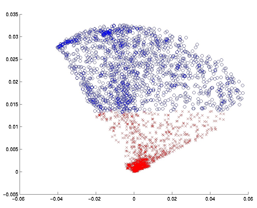
manifested in different clusters, we plot for each cluster the probability of each
message appearing in the cluster versus its probability of appearing
in the entire dataset. For a cluster that is highly distinctive among
messages, a relatively large number of messages would appear far from the diagonal.
Figure:
The probability of each message in the cluster versus its probability in the entire sample, with 3 clusters. Each row depicts the three clusters of one feature-set.
![\fbox{
\includegraphics[width=0.9\linewidth]{probPlot3clustersSpearmanLinearNocorr2.png}}](probPlot3clustersSpearmanLinearNocorr2.png) |
Plot
shows the case of three clusters. The
Spearman-based approach yields the most distinctive clusters. To
numerically estimate this difference, Table
shows
the mean ratio between the probability of a message appearing in a cluster and its probability within the entire sample set, averaged over all the clusters in each test.
Table:
The mean of the ratio between the probability of each message in each cluster and its probability in the general population. For ratios higher than  their inverse is taken. A smaller mean ratio implies a more distinctive clustering.
| Clusters |
Spearman |
Pearson |
FM |
| 2 |
0.65 |
0.77 |
0.82 |
| 3 |
0.62 |
0.77 |
0.77 |
| 4 |
0.57 |
0.74 |
0.78 |
| 5 |
0.57 |
0.75 |
0.76 |
|

![\fbox{
\includegraphics[width=0.8\linewidth,keepaspectratio]{mi3.png}
}](mi3.png)