Performance of the system was evaluated with a browser simulator called surf. surf reads a text file containing a list of URLs to access. It then issues HTTP requests for each of the URLs and fetches the dependents if necessary. surf simulates user reading time by sleeping an amount of time proportional to the HTML file size without the HTML tags. This is called the readspeed. If a URL is not retrieved within a certain amount of time, the whole URL is abandoned. This is specified by the impatience parameter and is used to detect Web sites that are down. There is also the caching version of surf called csurf. The only difference is that csurf fetches every unique URL only once per session. This simulates the internal browser cache.
We obtained 2000 random URLs from the Yahoo! Web site and divided them into 100 groups of 20 URLs to represent 100 different sessions. We then ran the csurf on the URLs with squid [4]. On a different client-server system, we ran surf with the proxy system (before the test, we ran surf 5 times for each of the 100 sessions over the proxy system to allow time for the proxy system to learn the access pattern). For both the tests, we set readspeed to be 128 chars/second and impatience to be 60 seconds. We synchronized the sessions between the two tests so that it cancels out the network activity that is time-based. We also cleared all caches (local and backbone) between sessions.
|
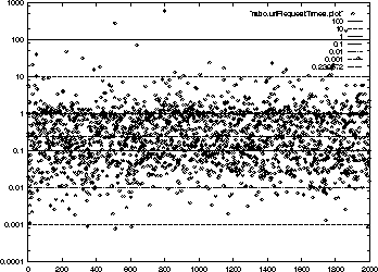
Figure 2 shows the ratio of each URL's delay time (HTML file together with image file times) plotted on a log scale. 79% of the URLs have a ratio of less than 1. This means that 79% of the URLs took less time with the proxy system. The 21% of the URLs that took equal or longer time can be attributed to the network variance in the Internet. The median ratio was 0.239572.
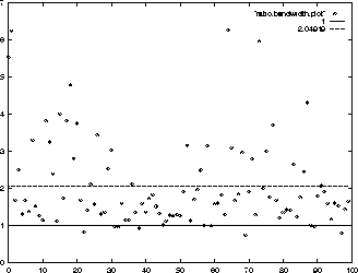
Figure 3 shows the ratio of each session's HTTP bandwidth. We see that on the average, we get twice the bandwidth, as far as the browser is concerned. Note that this is the mean value.
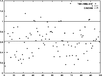
Figure 4 shows the ratio of the average URL request time per session. We see that on the average, each request takes only about 62% of the time it used to take. This means a faster response to the browser.
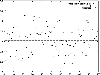
Figure 5 shows the ratio of the total network waiting time of each session. We notice that with the proxy system, on the average, we only wait 62.5% of the time we would normally wait in one session. Note that this graph is similar to Figure 4. It is only similar and not exact because of dynamic pages that return different dependents each time e.g. advertisements.
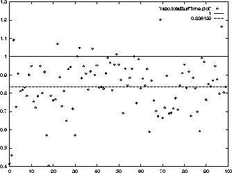
Figure 6 shows the ratios of the total time taken to complete each of the 100 sessions. The times included network waiting time, sleeping time (to simulate reading), and CPU overhead time. We see that even though 21% of the individual URL request times were equal or slower, grouping URLs into sessions amortizes the time, and only 8%-10% of the sessions are slower than before. We also see that on the average (over 100 sessions), we spend only 83% of the time we spend on a Web session when we are using the proxy system.
Finally, we collated the times of the 2000 URLs to see how the proxy system will perform in the long term. It must be noted that the value we get here is actually lower than what we would have gotten had we used a 2000 URL session. This is because we cleared all caches between sessions.
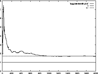
Figure 7 shows that, on the average, the browser observes a bandwidth increase of 1.7 times when the proxy system is being used.
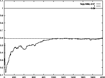
Figure 8 shows that, on the average, for individual HTTP request delay, the browser waits only 59% of the time. As expected, this is roughly the inverse of the bandwidth improvement.
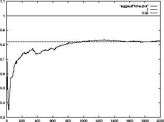
Figure 9 shows that, on the average, the user spends only 82% of the time he/she would have if he/she only used a single backbone proxy.