
We use a force-directed method similar to previous work [8] [6] to lay out the graph. The basic idea is to model the graph as a physical system and then to find the set of node positions that minimizes the total energy. The standard model employed is spring attraction and electrical repulsion. Attraction is done by connecting any two connected nodes by a spring. The repulsive force derives by giving each node a positive electrical charge, so that they repel each other.
Once you have this model, finding a minimum has been well studied. In particular, the most common techniques are gradient descent [13], conjugate gradient [14], and simulated annealing [13]. None of these algorithms are guaranteed to find a global minimum in a reasonable time, but they are able to approximately minimum configurations. We choose to use gradient descent because of the ease of coding it.
Previous work on graph drawing, however, has considered graphs the size of our Internet dataset as huge [9] [16], and extending the runtime results of previous work to our graph and adjusting for a faster machine yield times on the order of months to millennia. Thus, the standard algorithms are too slow for our graph. We employ two tricks to more quickly compute a layout, at the cost of possibly being less optimal.
The first trick is replace the electrical repulsive field with spring repulsion. Imagine that any two nodes which do not share an edge are connected, via infinite strings, to a spring. Thus, if the nodes are further apart than the rest length of the spring, there is no force applied. If the nodes are are closer than the spring's rest length, the spring is compressed, and the nodes are pushed apart. This gives us a bounded repulsive force, which means that instead of having to calculate a quadratic number of repulsive forces, the number of repulsive forces goes down to approximately linear, since pairs of points that are further apart than the rest length can be ignored. Thus, the exact repulsive force on each node can be calculated in approximately linear time.
The real optimization, however, is laying out the graph one layer at a time. First the links to our three ISPs are laid out and the system is iterated until they stop moving ``very much.'' Then, all the routers one hop further away are added, and the system is iterated (which may move the nodes from previous levels as well). Then the next hop, and so on. This tends to give placement based on information high in the tree. A movie of an early version of the layout process for Lucent data is available at our web page [24].
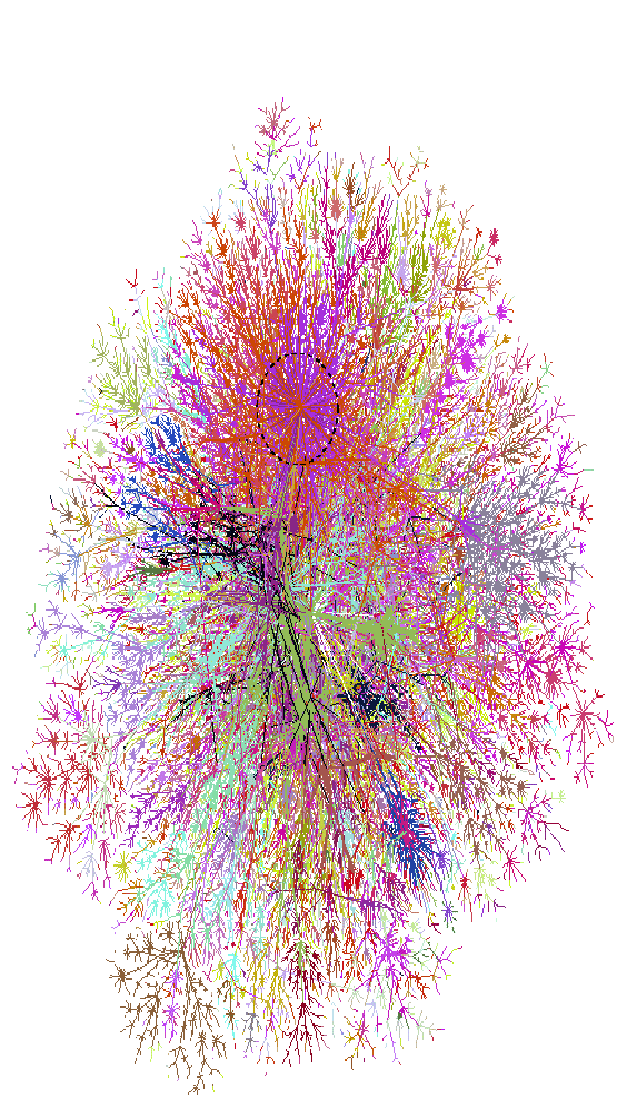 |
Our original layouts showed all the paths. This resulted in a picture such as figure 1 2. While the middle is mostly a muddle, the edges showed intriguing details. Note that a 36x40 inch plot is much more useful--a dense graph is easier to view on a larger printout. Dave Presotto described this smaller version as a smashed peacock on a windshield.
The map is colored using IP address; the first three octets of the IP number are used as the red, green, and blue color values respectively. This simplistic coloring actually shows communities and ISPs quite well.
We can already see features on this map: The fans at the edges show some interesting communities: Finland, AOL, some DISA.MIL, and Telstra (Australia and New Zealand). Looking at the color version of the map reveals a middle that is very muddled, showing our ISPs at the time: UUnet (green) and BBN (deep blue). SprintNet (sky blue) peeks through the sides.
The eye is drawn to a rather large star at the top of the picture, which represents the Cable and Wireless (cw.net) backbone, formerly the MCI backbone, formerly NSFnet. It is a major feature (if not the major feature) on the map. There are two reasons for this: (i) they are a huge backbone provider, and (ii) their backbone is an ATM network, connecting well over a hundred nodes around the world. Since our scanning is run at the IP level (level 3), this large network collapses to a single point. The smaller ``Koosh'' balls may be other ATM networks--we have not investigated this.
This map has changed over time, as we change our routing and ISP configurations. As we have done so, the predominant colors have changed as well.
We started collecting and preserving DNS names for the routers in March 1999. The collection of canonical names provides a rich source of data we can use to color the graph drawing. For example, colors can be selected based on top-level domain, showing the approximate country location of the hosts, or second-level domain, showing ownership of hosts.