|
WiTMeMo '05 Paper
[WiTMeMo '05 Technical Program]
Modeling users' mobility among WiFi access points
Minkyong Kim and David Kotz
{minkyong,dfk}@cs.dartmouth.edu
Department of Computer Science
Dartmouth College
Abstract
Modeling movements of users is important for simulating wireless networks, but
current models often do not reflect real movements. Using real mobility traces,
we can build a mobility model that reflects reality. In building a mobility
model, it is important to note that while the number of handheld wireless
devices is constantly increasing, laptops are still the majority in most cases.
As a laptop is often disconnected from the network while a user is moving, it is
not feasible to extract the exact path of the user from network messages. Thus,
instead of modeling individual user's movements, we model movements in terms of
the influx and outflux of users between access points (APs). We first
counted the hourly visits to APs in the syslog messages recorded at APs. We
found that the number of hourly visits has a periodic repetition of 24 hours.
Based on this observation, we aggregated multiple days into a single day
by adding the number of visits of the same hour in different days.
We then clustered APs based on the different peak hour of visits.
We found that this approach of clustering is effective; we ended up with four
distinct clusters and a cluster of stable APs. We then computed the average
arrival rate and the distribution of the daily arrivals for each cluster. Using
a standard method (such as thinning) for generating non-homogeneous
Poisson processes, synthetic traces can be generated from our model.
1 Introduction
Modeling the movements of mobile users between access points (APs) is important
for simulating wireless networks. It is often not feasible to test new
technologies in real wireless networks, especially not on a large scale.
Simulations allow developers and researchers to try these new technologies
before real-world deployment. To simulate wireless networks at the AP
level, we need a model that describes movements between APs. For example, we can
estimate AP load or test resource allocation mechanisms [10] with such
a movement model.
In developing a mobility model, we have three goals. First, the model should
reflect real user movements. Currently available mobility models are not based
on real traces and may not reflect real mobility patterns. Second, the model
should be general enough to describe the movements of every device. When a user
is moving, handheld devices often stay turned on, while laptops are disconnected
from the network. Thus, it is not feasible to extract the physical path of
laptop users by looking at network messages. Third, the model should consider
the hourly variations over a day. A mobile user's movements are highly affected
by the time of day, and as a result the load of APs changes over time during a
day. For example, APs located at a cafeteria are visited most during lunch
time. Thus, it is important to consider the hourly variations.
In this paper, we present a model of user movements between APs. From the
syslog messages collected on the Dartmouth campus, we count the number of visits
to each AP. Based on the observation that most APs have strong daily
repetition, we aggregate the multiple days of the hourly visits into a
single day. We then cluster APs based on their peak hour. We derive four
clusters with different peak times and one cluster consisting of stable APs
whose number of visits does not change much over 24 hours. To model a cluster,
we compute hourly arrival and departure rates, and the distribution of daily
arrivals. We leave the evaluation of this model as future work.
2 Clustering
In this section, we describe the traces that we used and how we discovered the
period of repetition in the traces. We then describe the method of clustering
APs.
2.1 Traces
We used the wireless network data collected at Dartmouth College. To observe
regular student activities, we chose two months---from April 1 to May 31,
2003---that did not contain a long study break. Whenever clients authenticate,
associate, reassociate, roam, disassociate or deauthenticate with an AP, a
syslog message is recorded. Each message contains a timestamp in seconds, the
client's MAC address, the AP name, and the event type. During two months, we
observed 13,888 clients associating with 533 access points.
We used a filter to convert the syslog traces into the sequence of APs that each
client associates with. This filter also defines the OFF state, which represents
a state of being not connected to the network. A device enters the OFF state
when it is turned off or when it loses network connectivity. The latter
sometimes causes devices to enter the OFF state for a short duration, lasting
only a few seconds. In terms of network messages, we assume that a client
becomes the OFF if it sends a disassociate or deauthenticate message. An AP also
generates a deauthenticate message for a client that has not sent any message
for the past thirty minutes. In this case, we consider that a client entered
OFF state thirty minutes prior to the time that the deauthenticate message was
generated. After conversion, our traces contain 30.1 million associations and
5.3 million OFFs.
2.2 Discovering strong period
As the first step for understanding association patterns, we counted the hourly
number of users at each access point over the two months of the traces. The
number of users at an AP during the ith hour is defined as
ui = ui-1 - li + ei,
where li is the number of users who left this AP during the ith hour, and
ei is the number of users who newly associated with this AP during the ith
hour. As a result, we have a 1464-element vector for each AP, each element
representing one hour in the 61-day period of our trace.
Instead of using a vector whose size increases linearly with the length of
traces, is it possible to aggregate this information? For instance, if there is
any periodic repetition, we can aggregate the values based on that period. To
discover the period of repetition, we used the Discrete Fourier Transform (DFT).
For each AP, we transformed the 1464-element vector from the time domain to the
frequency domain using DFT. We then chose the strongest frequency (or period)
signal.
The result shows that out of 533 APs, 64.5% of APs have one day as their peak
period. This means that the temporal pattern repeats every 24 hours. Based on
this observation, we aggregated 61 days into a single day by adding the number
of visits during the same hour of different days. We then ended up with a
24-element vector for each AP. From this, we removed APs that are not actively
used. We removed APs whose average hourly visits are less than three. This
reduced the number of APs from 533 to 203.
2.3 Clustering APs
Our experience with the Dartmouth traces has shown that different APs have their
peak number of users at different times of the day. For example, APs located at
a cafeteria experience the peak during lunch time. Based on this experience,
we clustered APs based on their peak hourWe considered using
AutoClass [2], a Bayesian-based clustering tool, which takes
fixed-size, ordered vectors of attribute values as input. We liked the fact that
it is a unsupervised classification tool (meaning that the number of classes
does not need to be specified beforehand), but did not use it because it does
not consider the relationship between input parameters..
We first want to identify the APs that are stable. Since the peak hour for these
APs is not significant, these APs should not be clustered based on this value.
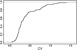
To find the `right' cutoff to distinguish stable APs, we plot the CDF of the
coefficient of variation (CV)---ratio of standard deviation to mean---of every
AP, shown in Figure 1. This figure shows a knee around the CV of
0.3. Thus, we used this value as our threshold to identify stable APs. There
are 108 APs whose CV is less than 0.3. These stable APs form the stable
cluster.
We then clustered the rest of APs based on their peak hour. As many hourly
clusters have similar patterns, we merged these similar clusters and ended up
with four clusters. Cluster 1 represents 11 APs with peak hours in the morning
(10 AM--noon). Cluster 2 consists of 8 APs with peak hours during lunch time
(noon--1 PM). Cluster 3 represents 40 APs with peak hours in the afternoon (1
PM--5 PM). Cluster 4 consists of 36 APs with peak hours in the evening (5 PM--1
AM). Note that none of APs had their peak hour in the early morning
(1 AM--10 AM).
Figure 1: Coefficient of Variation. This figure shows
the CDF of CV of standard deviation to mean of 203 APs.
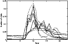
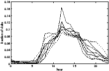
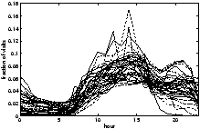
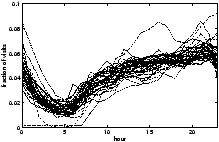
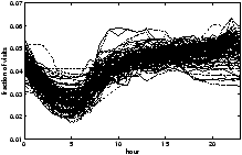
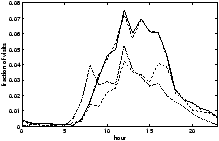
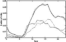
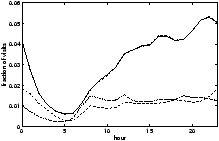
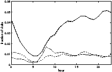
Figure 2 shows the hourly number of visits at each AP in the five
clusters. The hourly visits to an AP is normalized by the total visits across
the whole trace for that AP. The y-axis shows the fraction of visits that
happened during each hour. In Figure 2(a), most of the APs
experience a sudden increase in the number of visits at 8 AM; within two or
three hours after that, this number reaches its peak. Figure 2(b)
shows the APs with peak hours during lunch time. These APs have very similar
patterns in hourly visits. It is interesting to note that the graph is not
symmetric across 12 PM; while it increases sharply towards 12 PM, it decreases
slowly after 12 PM. We expect that this is due to the fact that some people have
lunch late since most cafeterias on the campus serve lunch until 2 or 2:30 PM.
Figure 2(c) shows the APs with peaks in the afternoon. The overall
trend is having peaks in the afternoon and most of them slowly decreasing after
that, while some having another smaller peak before decreasing.
Figure 2(d) shows the APs with peaks in the evening. The visits of
most of the APs in this cluster increase toward midnight.
Figure 2(e) shows the hourly visits at the stable APs. While most
of these APs experience a minimum between 5 and 6 AM as is the case with all
other clusters, the number of visits does not change significantly during the
rest of the day.
To show the similarity between the graphs within each cluster, we computed the
average difference between the hourly median of the cluster and the hourly
visits to each AP. The result is shown in Table 1.
The difference result shows that Cluster 1 and 3 are noisier than the rest.
|
| cluster |
start time |
end time |
APs |
diff |
|
| 1 |
10 AM |
12 PM |
11 |
1.8% |
| 2 |
12 PM |
1 PM |
8 |
0.8% |
| 3 |
1 PM |
5 PM |
40 |
1.2% |
| 4 |
5 PM |
1 AM |
36 |
0.5% |
| 5 |
stable |
|
108 |
0.3% |
|
Table 1: Clustered APs. Column Diff shows the average difference
between the hourly visits to APs and the hourly median of the corresponding cluster.
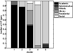
We expect that the location of APs that comprise each cluster is strongly
biased. To see whether this assumption is true, we consider the types of
buildings in which APs are located. We used six categories of buildings:
academic, administrative, athletic, library, residential, and
social [4]. Figure 3 shows the types of
buildings in which APs within each cluster are located. Cluster 1, which peaks
in the morning, consists mostly of academic buildings. Cluster 2, which peaks
during lunch time, also consists mostly of academic buildings. This is an
artifact of categorizing some of buildings that contain dining halls as
academic. Cluster 3, which peaks in the afternoon, consists mostly of academic
buildings and libraries. Cluster 4, which peaks in the evening, consists, not
surprisingly, mostly of residential buildings. Cluster 5 of stable APs also
consists mostly of residential buildings. This is because many people tend to
leave their devices at home connected to the wireless network. Thus, many APs in
residential areas do not experience fluctuations over the course of the day.
Figure 3: Building types. This figure shows the types
APs categorized based on buildings in which they are located.
To examine the location of APs in more detail, we mapped the
clustered APs on the campus map in Figure 4. We see that APs
in Cluster 2 are in fact located around two dining areas, marked by arrows.
Another interesting observation is that proximity between APs
does not necessarily guarantee that those APs will follow similar patterns of
usage. This observation agrees with our previous study of classification of
APs [7].

Figure 4: APs on campus map. This figure shows the APs and
their corresponding cluster. Note that only the actively used APs are clustered.
The arrows denote the two dining areas that contain the APs that peak
during lunch time.
3 Modeling
We want to derive a mobility model that captures activity of all the
wireless devices. Although the number of handheld devices is increasing
constantly, laptops still make up the majority of devicesThe earlier
study of Dartmouth traces [4] shows that laptops with Windows and
MacOS comprise over 76% of all the wireless devices. Smaller handheld devices
including Vocera devices and Cisco VoIP phones comprise 2.5%. (The rest are
unidentified.) in the Dartmouth wireless network. As people rarely use
laptops while walking, laptops tend to be connected to the network at one
location, disconnected while moving, and reconnected at another location. Due
to this pattern of usage, we cannot extract the exact path of a laptop user
from a source to a destination. To cope with these on-and-off devices,
we developed our model of wireless network usage in terms of the arrival rate at
each AP, instead of modeling the movements of individual users.
3.1 Hourly arrival and departure
To compute the arrival and departure rates, we counted the hourly number of
arrivals and departures. We consider every association to each AP. For
example, if the same user associates with an AP twice within an hour, both
associations of that user are added to the hourly arrival value of that AP.
Among the users that arrived at an AP, we considered separately those users that
were previously not connected and those that were connected to the network
through another AP; Ao,i denotes the number of arrivals from the OFF state
during the ith hour and Aa,i stands for the number of arrivals from
another AP during the ith hour. These two values are normalized by the total
number of arrivals, Atotal = �i=023 (Ao,i + Aa,i).
The average hourly departures are computed in the same way.
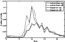
Figure 5 shows the average of the normalized hourly arrivals and
departures for each cluster of APs. There are several interesting characteristics
to note.
First, all of the clusters, except Cluster 1, have more transitions from/to
another AP than from/to the OFF state. The high number of transitions from/to
another AP is partly due to the ping-pong effect: associating repeatedly
with multiple APs. When a device is within the range of multiple APs, it often
changes its associated AP. Thus, changes in association do not necessarily mean
that the user moved physically. The ping-pong effect is especially common where
the density of APs is high.
Second, Cluster 1 has more transitions from/to OFF states than from/to another
AP. We expect that this is because many faculty and students turn on their
laptops during morning classes and connect to the network. Thus, these laptops
make transitions from the OFF state to APs.
Third, the time lag between the arrival at and departure from APs is small.
This means that the users who moved from one AP to another are not likely to
stay at the new AP for more than an hour. This short duration of stay is partly
due to the ping-pong effect.
Fourth, the time lag between the arrival from and departure to the OFF state is
relatively big, meaning that devices tend to stay long at an AP. We expect that
laptops are responsible for most of the transitions to/from the OFF state since
laptop users usually close their laptops while moving. Compared to handheld
devices, laptops are less affected by the ping-pong effect.
Thus, the long lag is partly due to laptops being less affected by the ping-pong
effect.
3.2 Daily average
Given that the arrival and departure rates that we computed in the previous
section are normalized, we need the actual number of arrivals and departures to
compute the hourly value. Table 2 shows the average daily arrival
and departure rates over APs within each cluster. Although the number of
arrivals is larger than the number of departures, the difference is small. This
implies that the number of visits at APs did not increase much during the two
months of the traces.
|
| cluster |
arrival |
departure |
|
| 1 |
115.177 |
115.171 |
| 2 |
84.699 |
84.693 |
| 3 |
121.363 |
121.334 |
| 4 |
298.915 |
298.829 |
| 5 |
237.434 |
237.333 |
|
Table 2: Daily arrival and departure rates.
To model the transitions between APs, the average over APs presented in
Table 2 may not be enough; although APs within a cluster
follow similar hourly variations, they are unlikely to have similar numbers of
arrivals. Thus, we need to consider what kind of distribution the daily number
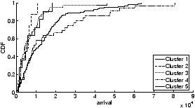
of arrivals follows within each cluster. Figure 6 shows the CDF of
arrivals for each cluster across all APs within that cluster.
Figure 6: Distribution of arrivals. This figure shows the
distribution of the total number of arrivals at APs for each cluster.
3.3 Generating traces
Using the arrival rate and the distribution of the actual number of arrivals at
each AP, we can generate synthetic traces. As our model is a process with
time-varying rates (i.e., a non-homogeneous Poisson process), we can use the
inversion, composition, or rejection (thinning) method [3] to
generate synthetic traces. Since we leave the trace generation and evaluation
of our model as future work, we describe thinning [9] only
briefly.
A non-homogeneous Poisson process is determined by a rate function lt.
Because the linear combination of Poisson processes is also another Poisson
process, we can generate a time-varying Poisson process by combining multiple
processes. In thinning, we first generate events using an exponential
interarrival time with mean 1/lmax where lmax is the
maximum rate of the time-varying process. At time t when an event is
scheduled, the event is either accepted with the probability of
lt/lmax or canceled with the probability of
1-lt/lmax.
In summary of Section 3, our model consists of the following three mobility
characteristics:
arrival rate following a time-varying Poisson process,
departure time (or duration of stay), and the distribution of the number of
arrivals at APs in each cluster.
One can generate synthetic traces from our model using a standard method.
4 Related work
There have been several studies of the traces collected on the Dartmouth campus.
Earlier studies [4, 8] characterize the usage of
wireless networks; there was no attempt to model user mobility. Jain
et al. [6] present a model of users' movements, but
focus on movement only within buildings while our model describes
the campus-wide movement of users.
Some more recent studies use real traces to create mobility models. Hsu
et al. [5] present a Weighted Way Point model developed from a
set of survey data of 268 students. Their data is limited compared to ours,
which includes all wireless users on the campus.
Bhattacharjee et al. [1] developed a hybrid mobility
model, which favors certain directions based on probabilities computed from the
observations made at only six locations on a large campus. Again, this data is
limited compared to our campus-wide data. Tuduce et al. [11]
developed a model from syslog traces collected on a university campus. The
number of APs that a node visits is chosen from the distribution extracted from
the traces. With this number, the sequence of visits to APs is chosen randomly.
Thus, the model is unlikely to describe users' actual sequence of associations.
Another weakness is that the movement time between APs is chosen from a uniform
random distribution. The model also does not capture variations over a day.
5 Conclusion and Future Work
In this paper, we present a mobility model of the movements between APs. This
model is developed using real mobility traces collected on the Dartmouth campus
and reflects the real movement patterns of the wireless users on the campus. In
the process of developing the model, we found that the number of visits to APs
exhibits a strong daily pattern.
We also found that clustering APs based on their peak time is effective; we
ended up with four distinct clusters and a cluster of stable APs. We then
computed the average arrival rate for each cluster and the distribution of the
daily arrivals. Using a well-known method (such as thinning) for
generating non-homogeneous Poisson processes, synthetic traces can be generated
from our model.
This paper presents ongoing work. In the future, we plan to pursue several
extensions. First, we would like to evaluate how closely our model describes
real movements between APs by comparing the synthetic and the real traces.
Second, we want to merge our model with a mobility model that describes the
physical movements (or paths) of individual users.
Third, we plan to explore seasonal trends such as variations between
academic terms and breaks and add these trends to our model.
References
- [1]
-
Bhattacharjee, D., Rao, A., Shah, C., Shah, M., and Helmy, A.
Empirical modeling of campus-wide pedestrian mobility: Observations
on the USC campus.
In Proceedings of the IEEE Vehicular Technology Conference
(September 2004).
- [2]
-
Cheeseman, P., and Stutz, J.
Bayesian classification (AutoClass): Theory and results.
In Advances in Knowledge Discovery and Data Mining
(Philadelphia, PA, USA, 1996), U. M. Fayyad, G. Piatetsky-Shapiro, P. Smyth,
and R. Uthurusamy, Eds., AAAI Press/MIT Press.
- [3]
-
Devroye, L.
Non-uniform random variate generation.
Springer-Verlag, New York, 1986.
- [4]
-
Henderson, T., Kotz, D., and Abyzov, I.
The changing usage of a mature campus-wide wireless network.
In Proceedings of MobiCom (Philadelphia, PA, USA, September
2004), ACM Press, pp. 187--201.
- [5]
-
Hsu, W., Merchant, K., Shu, H., Hsu, C., and Helmy, A.
Weighted waypoint mobility model and its impact on ad hoc networks -
MobiCom 2004 poster abstract.
Mobile Computing and Communications Review (Jan. 2005).
- [6]
-
Jain, R., Shivaprasad, A., Lelescu, D., and He, X.
Towards a model of user mobility and registration patterns.
MC2R 8, 4 (Oct. 2004), 59--62.
MobiHoc 2004 poster abstract.
- [7]
-
Kim, M., and Kotz, D.
Classifying the mobility of users and the popularity of access
points.
In Proceedings of the International Workshop on Location- and
Context-Awareness (LoCA) (May 2005), Lecture Notes in Computer Science,
Springer-Verlag.
- [8]
-
Kotz, D., and Essien, K.
Analysis of a campus-wide wireless network.
In Proceedings of MobiCom (September 2002), pp. 107--118.
- [9]
-
Lewis, P. A. W., and Shedler, G. S.
Simulation of nonhomogeneous poisson process by thinning.
Naval Research Logistics Quarterly 26 (1979), 403--413.
- [10]
-
Song, L., Kotz, D., Jain, R., and He, X.
Evaluating location predictors with extensive Wi-Fi mobility data.
In Proceedings of INFOCOM (March 2004), pp. 1414--1424.
- [11]
-
Tuduce, C., and Gross, T.
A mobility model based on WLAN traces and its validation.
In Proceedings of INFOCOM (March 2005).
|