
Sebastien Tricaud
INL
Imagine one has to collect elementary events of a given type (temperatures of all capitals of Asia, network traffic on a network adapter, etc.). Let's suppose that each given elementary event carries ![]() kinds of information and that
kinds of information and that
![]() is not small (greater than 4). Since it is not easy to plot vectors belonging to a space of more than 3 dimensions in a 3 dimensional physical space (not counting the time), it becomes necessary to adapt the representation technique.
is not small (greater than 4). Since it is not easy to plot vectors belonging to a space of more than 3 dimensions in a 3 dimensional physical space (not counting the time), it becomes necessary to adapt the representation technique.
In an ![]() -dimensional vector space
-dimensional vector space
![]() , one needs a basis of
, one needs a basis of
![]() vectors. Then each vector
vectors. Then each vector
![]() corresponds to an
corresponds to an
![]() -tuple of the form
-tuple of the form
![]() . In the usual euclidean space of dimension
. In the usual euclidean space of dimension
![]() , denoted
, denoted
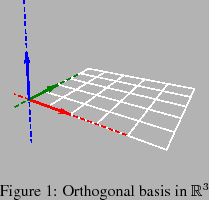
![]() , the canonical basis is orthogonal, which means that axes are considered pairwise perpendicular.
, the canonical basis is orthogonal, which means that axes are considered pairwise perpendicular.
Since it is impossible to draw more than 3 perpendicular axes in a 3 dimensional physical space, the idea behind ![]() -coords is to draw the axes side by side, all parallel to a given direction. It is then possible to draw all these axes in a 2d plane :
-coords is to draw the axes side by side, all parallel to a given direction. It is then possible to draw all these axes in a 2d plane :
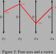
For example, the vector
![]() should show up as :
should show up as :
That point of
![]() has become a polygonal line in
has become a polygonal line in ![]() -coords. At first sight, it might seem that we have lost simplicity. Of course, on one side, it is obvious that many points will lead to many polygonal lines, overlapping each other in a very cumbersome manner. But on the other side, it is a fact that certain relationship between coordinates of the point correspond to interesting patterns in
-coords. At first sight, it might seem that we have lost simplicity. Of course, on one side, it is obvious that many points will lead to many polygonal lines, overlapping each other in a very cumbersome manner. But on the other side, it is a fact that certain relationship between coordinates of the point correspond to interesting patterns in ![]() -coords. For example, if
-coords. For example, if ![]() and
and ![]() are linked by an affine relationship
are linked by an affine relationship
![]() , a bow tie pattern appears in
, a bow tie pattern appears in ![]() -coords:
-coords:
It has been shown recently that points all belonging to certain hypersurfaces of
![]() induce complicated but structured patterns in
induce complicated but structured patterns in ![]() -coords, opening a way towards data classification.
-coords, opening a way towards data classification.
The data acquisition process we used in this paper aims to transform logs into the PCV file before Picviz treatment. In this paper, log is used interchangeably with data to express something that is captured from one or several machines. That being one in:
CSV being a common format to read and write such data, Picviz can take it as input and will translate it into PCV.
Picviz is a software transforming acquired data into a parallel coordinates plot image to visualize data and discover interesting results quickly.
Picviz is composed in three parts, each facilitating the creation, tuning and interaction of ![]() -coords graphs:
-coords graphs:
It was written because of a lack of visualization tools able to work with a large set of data. Graphviz is very close to how Picviz works, except that is has limitations regarding the number of dimensions that can be handled by a directed graph, such as when dealing with time.
Visualization is an answer to analyze a massive amount of lines of logs. ![]() -coords helps to organize them and
see correlations and issues by looking at the generated graph[#!951167!#].
-coords helps to organize them and
see correlations and issues by looking at the generated graph[#!951167!#].
Each axis strictly defines a variable: logs, even those that are unorganized, are always composed by a set of variables. At least they are: time when the event occurred, machine where the log comes from, service providing the log information, facility to get the type of program that logged, and the log itself.
The log variable is a string that varies widely based on the application writing it and what it is trying to convey. This variability of the string is what makes the logs disorganized. From this string, other variables can be extracted: username, IP address, failure or success etc.
Log sample: PAM session
Aug 11 13:05:46 quinificated su[789]:
 pam_unix(su:session): session opened
 for user root by toady(uid=0)
Looking at the PAM session log, we know how the user authenticates with the common pam_unix module. We know that the command su was used by the user toady to authenticate as root on the machine quinificated on August 11th at 1:05pm. This is useful information to care about when dealing with computer security. In this graph we clearly identify:
Figure ![[*]](crossref.png) shows the representation of the auth syslog facility:
shows the representation of the auth syslog facility:
Analysis
What one can easily see in figure is how many users logged in as root on the machine: red lines means
root destination user. Also, the leftmost axis (time) is interesting: it has a blank area and using the frontend we
discover that no one opened a session between 2:29am and 5:50am:
The second axis is the machine where the logs originated. Since this example is a single machine analysis, lines converge to a single point.
This third axis is the service or application that wrote the log. We can quickly see four services (one red, three blacks, the line at the bottom is also a connection between two axes): moving the mouse above the red line at the service on top of the figure shows that only the 'su' service is used to log a user as root. Hopefully no one logs in using gdm, kdm or login as root.
The fourth axis is the pam module that was used to perform the login authentication: again, as only local authentication was done using the pam_unix module, lines are converging. If we would have had a remote authentication, or other modules opening the session, we would see them on this axis.
The fifth and sixth axis are the user source and destination of the logs. We have as much source logins as destination logins. On this machines, logins are both su and ssh.
As experts might know, ![]() -coords are already used in computer security[#!1029216!#] but face a problem of not being easy to automate or with various data formats.
This paper focuses on how relevant security information can be extracted from logs, whatever format they have, how anyone can discover attacks or
software malfunctions and how the analyst can then filter and dig into data to discover high level issues. The next part covers how
Picviz was designed, its internals. After we will see how malicious attacks can be extracted, and how it can help you to write correlation rules.
-coords are already used in computer security[#!1029216!#] but face a problem of not being easy to automate or with various data formats.
This paper focuses on how relevant security information can be extracted from logs, whatever format they have, how anyone can discover attacks or
software malfunctions and how the analyst can then filter and dig into data to discover high level issues. The next part covers how
Picviz was designed, its internals. After we will see how malicious attacks can be extracted, and how it can help you to write correlation rules.
Below is an example of a source PCV file as structured to represent a single line:
header {
 title = "foobar";
}
axes {
 integer axis1 [label="First"];
 string axis2 [label="Second"];
}
data {
 x1="123",x2="foobar" [color="red"];
}
| Type | Range | Description |
| timeline | "00:00" - "23:59" | 24 hours time |
| years | "1970-01-01 00:00" - | Several years |
| "2023-12-31 23:59" | ||
| integer | 0 - 65535 | Integer number |
| string | "" - "No specific limit" | A string |
| short | 0 - 32767 | Short number |
| ipv4 | 0.0.0.0 - | IP address |
| 255.255.255.255 | ||
| gold | 0 - 1433 | Small value |
| char | 0 - 255 | Tiny value |
| enum | anything | Enumeration |
| ln | 0 - 65535 | Log(n) function |
Data are written line by line, each value coma separated. Four data entries with their relatives axes can be written like this:
data {
 t="11:30",src="192.168.0.42", \
             port="80" [color="red"];
 t="11:33",src="10.0.0.1",port="445";
 t="11:35",src="127.0.0.1",port="22";
 t="23:12",src="213.186.33.19", \
                        port="31337";
}
The key=value pair allows to identify which axis has which value. Since axis variable type was defined in the previous axis section, the order does not matter.
As of now, two properties are available: color and penwidth, which allow to set the line color and width respectively.
Data lines are generated by scripts from various sources, ranging from logs to network data or anything a script can capture and transform into PCV language data section. This paper focuses on logs, and Perl was choosen for its convenience with Perl Compatible Regular Expressions (PCRE) built-in with the language. The next part explains how such a script can be written to generated the PCV language.
Picviz delivers a set of tools to automate the PCV language generation from various sources, such as apache logs,
iptables logs, tcpdump, syslog, SSH connections, ...
Perl being suited language for this kind of task, it was chosen as the default generator language. Of course, nothing
prevent other people to write generators for their favorite language.
The PCV language is generated with the Perl print function, along with Perl pattern matching capabilities to write the data section. The syslog to PCV takes 25 lines of code, including lines colorization where the word 'segfault' shows up in the log file. Then, to use the generator, type:
perl syslog2pcv /var/log/syslog \
                      > syslog.pcv
To help finding evilness, a Picviz::Dshield class was written. Calling it will check if the port or IP address match with dshield.org database:
use Picviz::Dshield;

$dshield = Picviz::Dshield->new;

$ret = $dshield->ip_check("10.0.0.1")
It can be used to set the line color, to help seing an event correlated with dshield information database.
Aside from having a good looking graph, it is good to dig into it, and see what was generated. An interactive frontend was written for this purpose. It is even a good example on how Picviz library can be embeded in a Python application. The application picviz-gui was written in Python and Trolltech QT4 library.
The frontend provides a skillful interaction to find relationship among variables, allows to apply filters, drag the mouse over the lines to see the information displayed and to see the time progression of plotted events. Real-time capabilities are also possible, since the frontend listen to a socket waiting for lines to be written.
The frontend has limitations: on a regular machine, more than 10000 events makes the interface sluggish. As Picviz was designed to deal with million of events, a console program was written.
The pcv program is the CLI binary that takes PCV language as input, uses the picviz library output plugins and generate the graph using the called plugin. To generate a SVG, the program can be called like this:
pcv -Tsvg syslog.pcv > syslog.svg
As SVG is a vectorial format, this is reporting the scalability issue encountered with the frontend to third-party applications. So a PNG capable plugin was written, based on plplot1. That can be called like this:
pcv -Tplplot syslog.pcv
Plotting Options:
...
< 3> psc      PostScript File (color)
< 4> xfig     Fig file
...
<16> pngcairo Cairo PNG Driver

Enter device number or keyword: 16
Enter graphics output file name: \
                          syslog.png
PNG output is preferred to the use of a frontend, to handle million of events. You can then use the filtering Picviz provides to remove useless information and finally use the frontend with those filtered data. Section 2.3.4 explains how events can be filtered.
Because choosing the right order for the right axis is one of ![]() -coords disadvantages, Picviz provides via the plplot plugin
a Grand tour capability. The Grand tour generates as much images as pairs permutation of axes possible, the
idea is to show every possible relation among every available axes. Plugin arguments are provided with the -A command. So
to generate a grand tour on graphs, pcv should be called like this:
-coords disadvantages, Picviz provides via the plplot plugin
a Grand tour capability. The Grand tour generates as much images as pairs permutation of axes possible, the
idea is to show every possible relation among every available axes. Plugin arguments are provided with the -A command. So
to generate a grand tour on graphs, pcv should be called like this:
pcv -Tplplot syslog.pcv -Agrandtour
...
File Time-Machine.png written
File Time-Service.png written
...
File Log-Machine.png written
File Log-Service.png written
To select lines one want to be displayed, Picviz provides filters. They can be used on the real value to match a given regular expression, line frequency, line color or position as mapped on the axis. It is a multi-criterion filter. It is set with the CLI or Frontend parameters.
With the CLI, they can be called like this:
pcv -Tplplot syslog.pcv \
      'your filter here'
With the frontend, filter can be called like this:
picviz-gui syslog.pcv \
      'your filter here'
Filter syntax is:
display type relation value \
  on axis number && ...
Where:
For example, to display all lines plotted under a hundred on the second axis, one can replace your filter here by show only plot ![]() 100 on axis 2. Specific data can also be removed, such as:
100 on axis 2. Specific data can also be removed, such as:
pcv -Tplplot syslog.pcv \
  'hide value = "sudo" on axis 2'
A percentage can be applied to avoid knowing the value that can be filtered: 'show plot ![]() 42% on axis 3 and plot
42% on axis 3 and plot ![]() 20% on axis 1'.
20% on axis 1'.
One of the basic string algorithm displaying is to simply add the ascii code to create a number. Among pros of using this very naive algorithm, is to be able to display scans (strings very close to each other coming from one source) very easily. As for the cons there is the collision risk, but in practice this low risk of having such events. As Picviz is very flexible, it still offer other string alignment algorithms, using Levenstein[#!levelshtein-66-binary!#] or Hamming distance[#!ha50!#] from a reference string. This still makes collision possible, but differently.
The basic algorithm highlights scans evidences, and then one can quickly spot an issue. This way, without having any knowledge of how the log must be read, little changes will appear close enough to each other to grab the reader attention.
The following lines are logs taken from ssh authentication, and appear like this:
time="05:08", source="192.168.0.42",
 log="Failed keyboard-interactive/pam
           for invalid user lindsey";
time="05:08", source="192.168.0.42",
 log="Failed keyboard-interactive/pam
            for invalid user ashlyn";
time="05:08", source="192.168.0.42",
 log="Failed keyboard-interactive/pam
             for invalid user carly";
Figure shows a generated graph from twenty lines of a ssh scan.
On the third axis, one can clearly see the lines sweep, showing the scan.
With ![]() -coords, several correlations are possible, as shown in figure , where it is known for sure
all events share a common variable.
-coords, several correlations are possible, as shown in figure , where it is known for sure
all events share a common variable.
Because ![]() -coords are multi-dimensional, what can be seen in figure which is in two dimension can lead to more
interesting pattern discovery of a bow tie generates an other, which generates again an other, and so forth...It draws a path where every
value is guessable.
-coords are multi-dimensional, what can be seen in figure which is in two dimension can lead to more
interesting pattern discovery of a bow tie generates an other, which generates again an other, and so forth...It draws a path where every
value is guessable.
One other way to correlate is applying a line colorization for their frequency of apparition between two axes and colorize the whole line, according to the highest value. Picviz can generate graphs in this mode with the heatline rendering plugin and its virus mode.
As of today, only the svg and pngcairo handle this feature. Picviz CLI should be called like this:
pcv -Tpngcairo syslog.pcv -Rheatline \
  -Avirus > syslog.png
The next section covers how we can efficiently see attacks from many lines of log and finally write a correlation script in perl.
When a SSH connection occurs, one in the following lines of log is written in the syslog auth facility, which is in the file /var/log/auth.log on a Linux Debian system:
Aug 18 20:45:53 jazz sshd[26424]:    \
  Accepted publickey for toady from  \
  192.168.1.23 port 63379 ssh2
Aug 18 20:49:47 jazz sshd[26444]:    \
  Accepted keyboard-interactive/pam  \
  for toady from 192.168.1.42 port   \
  1115 ssh2
Aug 18 21:02:38 jazz sshd[26592]:    \
  error: PAM: Authentication failure \
  for toady from 192.168.1.42
We Generate PCV files with a perl script using the following regular expression to get all SSH connection attempts:
\w+  ?\d+ (\d+:\d+:\d+) [\w-.]+ \
sshd.*: (.*) for (\S+) from     \
(\d+.\d+.\d+.\d+)
This creates fours axes: Time, Authentication type, IP source and Login. The script is combined with the Picviz::Dshield class we have seen earlier so IP addresses matching the Dshield database will appear in red.
Our perl script is executed:
ssh-auth2pcv.pl /var/log/auth.log \
                        > auth.pcv
It will dig dshield for IP addresses in the top 10000 of those matching firewall logs subscribed to dshield.org, and match ssh logs against those IP addresses, and draw them in red if they match (see figure ).
First of all, a few fact that can be seen interactively but impossible to see on a static printed paper like here. On the time axis, midnight is at the bottom and 23:59:59 at the very top. Two authentication types (second axis) are extracted: 'Failed password' and 'Accepted keyboard-interactive/pam'. On the third axis, IP Source are various, as one can see in the graph and there is only one login used to open a session.
There are several things that are instantaneously seen in the resulted graph:
The discovered IP source address is none if those the target user uses to log in, its account may have been compromised, at least one need to investigate why the person behind this login logs from several IP sources. ![]() -coords are surprisingly good to catch those things.
-coords are surprisingly good to catch those things.
As a conclusion, most Host IDS will generate an alert upon authentication. However, few administrators will really consider them. In this case, visualization can help them to wonder why several IP addresses were used to log in. Just looking over the visualized logs was enough to make us have the idea and want to automate the detection of this kind of behavior. The next section explains how two correlation rules can easily be written using the Perl programming language.
In the last section, using ![]() -coords, two possible attacks were discovered. Showing how insightful they led us to wonder how several IP addresses can actually be used to log into an account without the operator being able to catch the alert sent by the Host IDS. Fortunately, its automation is easy and the goal of this section is to show a perl script can in this particular case replace the visualization.
-coords, two possible attacks were discovered. Showing how insightful they led us to wonder how several IP addresses can actually be used to log into an account without the operator being able to catch the alert sent by the Host IDS. Fortunately, its automation is easy and the goal of this section is to show a perl script can in this particular case replace the visualization.
It is good to consider visualization as a tool, that can sometime be very helpful but can often hardly be automated. The point we want to focus here is that visualization helped us to have the idea. Picviz can help to write correlation rulesets for intrusion detection and help to understand better than an isolated event[#!Debar01aggregationand!#].
Our perl script should be able to automate the following:
All of what is needed is to write Perl code to construct information we will then use to send alerts[#!artcor!#]:
if (!$users{$login}) {
 push @{$users{$login}},
        "$src,$authtype";
} else {
 foreach $val (@{$users{$login}}) {
  ($ipsrc,$ipauth) = split(/,/,$val);
  if ($ipsrc ne "$src") {
    push @{$users{$login}}, "$val";
    if ($ipauth ne $authtype) {
      push(@ip_authtypes, $ipsrc);
    }
    last;
 }
 }
}
And to send the alert:
while(($key, $value) = each(%users)) {
 if (@{$value} >= 2) {
   print "*** Alert ***\n";
   print "Different IP addresses
          for one user\n";
  ($ipsrc,$ipauth) = split(/,/,$value);
  print "Source IP: $ipsrc"
  $client << $idmef;
 }
}
This paper explained what we can do with ![]() -coords and system logs. Ranging from better understanding, see some network security anomalies
and see how unexpected things can be discovered. That can lead to write a simple script to warn about a specific behavior. Visualization is an
important and growing part of security
that can be used for several things: one is to have non-expert able to understand complex attack they can latter report to the analyst, the other is
to help the analyst to dig where he he would not do normally but also, help to write better tools to automate intrusion detection. The future of
Picviz will be to automate visually correlations and go further than
-coords and system logs. Ranging from better understanding, see some network security anomalies
and see how unexpected things can be discovered. That can lead to write a simple script to warn about a specific behavior. Visualization is an
important and growing part of security
that can be used for several things: one is to have non-expert able to understand complex attack they can latter report to the analyst, the other is
to help the analyst to dig where he he would not do normally but also, help to write better tools to automate intrusion detection. The future of
Picviz will be to automate visually correlations and go further than ![]() -coords to make a better representation of axes correlations.
-coords to make a better representation of axes correlations.
I would like to thank Alfred Inselberg for his great achievements with ![]() -coords, and his encouragements upon my work
with Picviz. Philippe Saadé for the research conducted together on improving
-coords, and his encouragements upon my work
with Picviz. Philippe Saadé for the research conducted together on improving ![]() -coord and Pierre Chifflier on IDS correlation.
Steve Grubb, Lukas Kuklinek and Tomas Heinrich for their work done at Red Hat in intrusion detection, Prelude IDS and
their Picviz package available in next Fedora release. Yoann Vandoorselaere for his great work leading the Prelude IDS project.
As well as INL, a very good place to work surrounded by bright people and their will to innovate in the computer security area.
-coord and Pierre Chifflier on IDS correlation.
Steve Grubb, Lukas Kuklinek and Tomas Heinrich for their work done at Red Hat in intrusion detection, Prelude IDS and
their Picviz package available in next Fedora release. Yoann Vandoorselaere for his great work leading the Prelude IDS project.
As well as INL, a very good place to work surrounded by bright people and their will to innovate in the computer security area.
This document was generated using the LaTeX2HTML translator Version 2002-2-1 (1.71)
Copyright © 1993, 1994, 1995, 1996,
Nikos Drakos,
Computer Based Learning Unit, University of Leeds.
Copyright © 1997, 1998, 1999,
Ross Moore,
Mathematics Department, Macquarie University, Sydney.
The command line arguments were:
latex2html -split 0 -show_section_numbers -local_icons -no_navigation fanih-usenix2008.tex
The translation was initiated by Sebastien Tricaud on 2008-11-14
![\begin{Figure}
% latex2html id marker 51\begin{center}
\includegraphics[width=15em]{eps/pp_4_axes_vides.ps}
\end{center}\caption{Four axes}
\end{Figure}](img8.png)
![\begin{Figure}
% latex2html id marker 68\begin{center}
\includegraphics[width=20em]{eps/correlation2.eps}
\end{center}\caption{2D Line relationship}
\end{Figure}](img15.png)
![\begin{Figure}
% latex2html id marker 128\begin{center}
\includegraphics[width...
...ght=7em]{eps/time-zoom.eps}
\end{center}\caption{Zoom on time axis}
\end{Figure}](img17.png)
![\begin{Figure}
% latex2html id marker 145\begin{center}
\includegraphics[width...
...m]{eps/pam_module.eps}
\end{center}\caption{PAM module convergence}
\end{Figure}](img18.png)